Page 1 of 1
weird html question...
Posted: Mon Oct 02, 2023 2:46 am
by celestefem
so, i was trying to make a quick little layout based off of this swapnote theme, yeah?

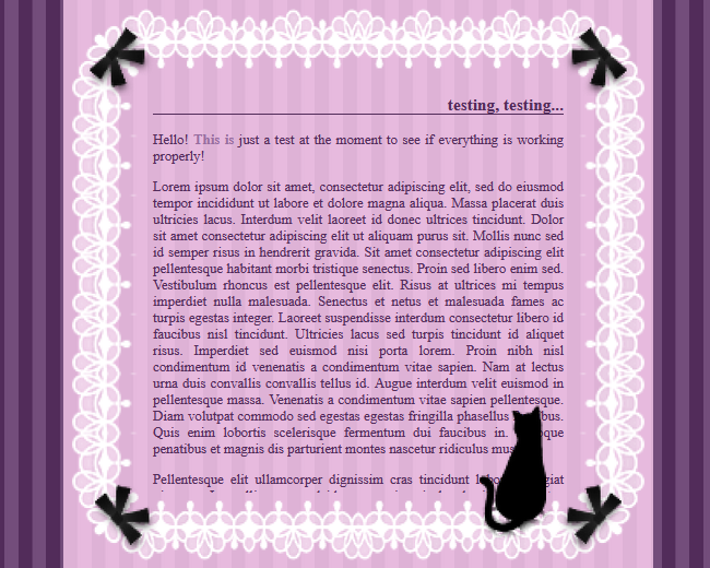
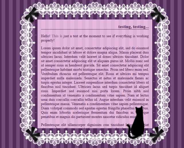
but i ran into the problem that i couldn't get the background inside the lacy border to stop at the right place, if that makes sense? so i'd either end up with this:

or this:

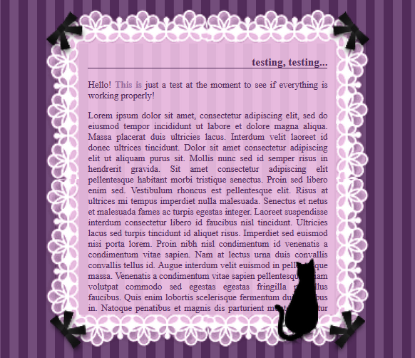
i eventually ended up editing the lace border so it wouldn't stick out so much, which does basically work:

but i wonder if there's an actual way of dealing with a transparent border like this? or if there's a different method i should be using entirely or something?
here are a few codepens, if you wanted to look at them, idk. (also the code is very messy and i kinda adapted it from an older theme i made so some of the class names are weird...)
third picture
final picture
if you're able to explain a better way of doing this in the future or anything, thanks! ^^
Re: weird html question...
Posted: Mon Oct 02, 2023 5:29 pm
by pom
I think with the border image itself, there's really not much you can do. An image is static and has varying degrees of transparency. But with the div with the text and background. I know css supports opacity. there might be away to "map" all the edge to like fade into a lighter opacity to make it blend more.
Here is kinda of a similar example.
Re: weird html question...
Posted: Tue Oct 03, 2023 2:32 am
by hors
This is such a cute idea! In your first try, you can use border-image-outset to reposition the border. Border-image-outset:50px seems to look about right for the first codepen with the background color applied to the parent div. Image borders can be kind of finicky though, so I think the solution you ended up with is actually the best one already.
Of course there is always the option of not using an image as the border but I'm assuming you did it this way for some degree of responsiveness?
Re: weird html question...
Posted: Tue Oct 03, 2023 5:57 pm
by celestefem
thanks for the advice, both of you! ^^
pom wrote: Mon Oct 02, 2023 5:29 pm
I think with the border image itself, there's really not much you can do. An image is static and has varying degrees of transparency. But with the div with the text and background. I know css supports opacity. there might be away to "map" all the edge to like fade into a lighter opacity to make it blend more.
Here is kinda of a similar example.
it seems like if you try to use a transparent gradient, you'd have to layer a bunch of smaller rectangles to achieve this effect, since the only options are radial and linear gradients? i'm kinda not good enough with positioning things in css to do that, i think, rip. i was also trying to make a completely separate div (without the border or text in it) to have the stripey pattern in, but i had issues trying to line that up, as well...
hors wrote: Tue Oct 03, 2023 2:32 am
This is such a cute idea! In your first try, you can use
border-image-outset to reposition the border. Border-image-outset:50px seems to look about right for the first codepen with the background color applied to the parent div. Image borders can be kind of finicky though, so I think the solution you ended up with is actually the best one already.
Of course there is always the option of not using an image as the
border but I'm assuming you did it this way for some degree of responsiveness?
the 'border-image-outset' was actually what i was looking for, i think! ...but yeah, it doesn't really look the best in this specific scenario, either, unfortunately.
and yeah, i was doing it this way so it'd be responsive. otherwise, the easier option would be to just edit the whole border & background together in photoshop and use it as a background image, right?
i think i will just leave it as is, but i will keep what you brought up in mind for future layouts! thanks, again!
